Responsive web design is about creating web pages that look good on all devices!
A responsive web design will automatically adjust for different screen sizes and viewports.
What is Responsive Web Design?
Responsive Web Design is about using HTML and CSS to automatically resize, hide, shrink, or enlarge, a website, to make it look good on all devices (desktops, tablets, and phones):
<!DOCTYPE html>
<html>
<head>
<meta name="viewport" content="width=device-width, initial-scale=1.0">
<style>
* {
  box-sizing: border-box;
}
.menu {
  float: left;
  width: 20%;
}
.menuitem {
  padding: 8px;
  margin-top: 7px;
  border-bottom: 1px solid #f1f1f1;
}
.main {
  float: left;
  width: 60%;
  padding: 0 20px;
  overflow: hidden;
}
.right {
  background-color: lightblue;
  float: left;
  width: 20%;
  padding: 10px 15px;
  margin-top: 7px;
}

@media only screen and (max-width:800px) {
  /* For tablets: */
  .main {
    width: 80%;
    padding: 0;
  }
  .right {
    width: 100%;
  }
}
@media only screen and (max-width:500px) {
  /* For mobile phones: */
  .menu, .main, .right {
    width: 100%;
  }
}
</style>
</head>
<body style="font-family:Verdana;">

<div style="background-color:#f1f1f1;padding:15px;">
  <h1>Cinque Terre</h1>
  <h3>Resize the browser window</h3>
</div>

<div style="overflow:auto">
  <div class="menu">
    <div class="menuitem">The Walk</div>
    <div class="menuitem">Transport</div>
    <div class="menuitem">History</div>
    <div class="menuitem">Gallery</div>
  </div>

  <div class="main">
    <h2>The Walk</h2>
    <p>The walk from Monterosso to Riomaggiore will take you approximately two hours, give or take an hour depending on the weather conditions and your physical shape.</p>
    <img src="img_5terre.jpg" style="width:100%">
  </div>

  <div class="right">
    <h2>What?</h2>
    <p>Cinque Terre comprises five villages: Monterosso, Vernazza, Corniglia, Manarola, and Riomaggiore.</p>
    <h2>Where?</h2>
    <p>On the northwest cost of the Italian Riviera, north of the city La Spezia.</p>
    <h2>Price?</h2>
    <p>The Walk is free!</p>
  </div>
</div>


<div style="background-color:#f1f1f1;text-align:center;padding:10px;margin-top:7px;font-size:12px;"> This web page is a part of a demonstration of fluid web design made by w3schools.com. Resize the browser window to see the content respond to the resizing.</div>

</body>
</html>
Setting The Viewport
To create a responsive website, add the following <meta> tag to all your web pages:
Example
<!DOCTYPE html>
<html>
<head>
<meta name="viewport" content="width=device-width, initial-scale=1.0">
</head>
<body>

<h2>Setting the Viewport</h2>
<p>This example does not really do anything, other than showing you how to add the viewport meta element.</p>

</body>
</html>
This will set the viewport of your page, which will give the browser instructions on how to control the page’s dimensions and scaling.
Here is an example of a web page without the viewport meta tag, and the same web page with the viewport meta tag:
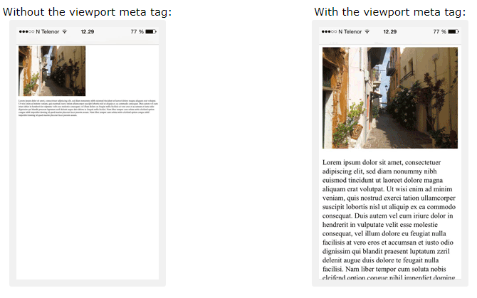
Tip: If you are browsing this page on a phone or a tablet, you can click on the two links above to see the difference.
Responsive Images
Responsive images are images that scale nicely to fit any browser size.
Using the width Property
If the CSS width property is set to 100%, the image will be responsive and scale up and down:

Example
<!DOCTYPE html>
<html>
<head>
<meta name="viewport" content="width=device-width, initial-scale=1.0">
</head>
<body>

<h2>Responsive Image</h2>
<p>When the CSS width property is set in a percentage value, the image will scale up and down when resizing the browser window. Resize the browser window to see the effect.</p>

<img src="img_girl.jpg" style="width:100%;">

</body>
</html>
Notice that in the example above, the image can be scaled up to be larger than its original size. A better solution, in many cases, will be to use the max-width property instead.
Using the max-width Property
If the max-width property is set to 100%, the image will scale down if it has to, but never scale up to be larger than its original size:
Example
<!DOCTYPE html>
<html>
<head>
<meta name="viewport" content="width=device-width, initial-scale=1.0">
</head>
<body>

<h2>Responsive Image</h2>
<p>"max-width:100%" prevents the image from getting bigger than its original size. However, if you make the browser window smaller, the image will still scale down.</p>
<p>Resize the browser window to see the effect.</p>

<img src="img_girl.jpg" style="max-width:100%;height:auto;">

</body>
</html>
Show Different Images Depending on Browser Width
The HTML <picture> element allows you to define different images for different browser window sizes.
Resize the browser window to see how the image below changes depending on the width:
Example
<!DOCTYPE html>
<html>
<head>
<meta name="viewport" content="width=device-width, initial-scale=1.0">
</head>
<body>

<h2>Show Different Images Depending on Browser Width</h2>
<p>Resize the browser width and the image will change at 600px and 1500px.</p>

<picture>
  <source srcset="img_smallflower.jpg" media="(max-width: 600px)">
  <source srcset="img_flowers.jpg" media="(max-width: 1500px)">
  <source srcset="flowers.jpg">
  <img src="img_flowers.jpg" alt="Flowers" style="width:auto;">
</picture>

</body>
</html>
Responsive Text Size
The text size can be set with a “vw” unit, which means the “viewport width”.
That way the text size will follow the size of the browser window:
Hello World
Resize the browser window to see how the text size scales.
Example
<!DOCTYPE html>
<html>
<head>
<meta name="viewport" content="width=device-width, initial-scale=1.0">
</head>
<body>

<h1 style="font-size:10vw;">Responsive Text</h1>

<p style="font-size:5vw;">Resize the browser window to see how the text size scales.</p>

<p style="font-size:5vw;">Use the "vw" unit when sizing the text. 10vw will set the size to 10% of the viewport width.</p>

<p>Viewport is the browser window size. 1vw = 1% of viewport width. If the viewport is 50cm wide, 1vw is 0.5cm.</p>

</body>
</html>
Viewport is the browser window size. 1vw = 1% of viewport width. If the viewport is 50cm wide, 1vw is 0.5cm.
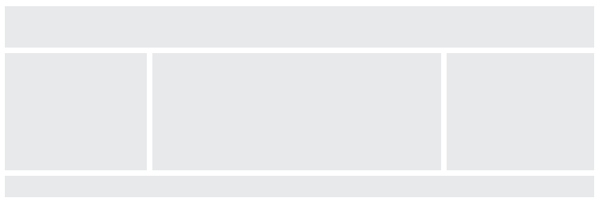
Media Queries
In addition to resize text and images, it is also common to use media queries in responsive web pages.
With media queries you can define completely different styles for different browser sizes.
Example: resize the browser window to see that the three div elements below will display horizontally on large screens and stack vertically on small screens:
<!DOCTYPE html>
<html>
<head>
<meta name="viewport" content="width=device-width, initial-scale=1.0">
<style>
* {
  box-sizing: border-box;
}

.left {
  background-color: #2196F3;
  padding: 20px;
  float: left;
  width: 20%; /* The width is 20%, by default */
}

.main {
  background-color: #f1f1f1;
  padding: 20px;
  float: left;
  width: 60%; /* The width is 60%, by default */
}

.right {
  background-color: #04AA6D;
  padding: 20px;
  float: left;
  width: 20%; /* The width is 20%, by default */
}

/* Use a media query to add a break point at 800px: */
@media screen and (max-width: 800px) {
  .left, .main, .right {
    width: 100%; /* The width is 100%, when the viewport is 800px or smaller */
  }
}
</style>
</head>
<body>

<h2>Media Queries</h2>
<p>Resize the browser window.</p>

<p>Make sure you reach the breakpoint at 800px when resizing this frame.</p>

<div class="left">
  <p>Left Menu</p>
</div>

<div class="main">
  <p>Main Content</p>
</div>

<div class="right">
  <p>Right Content</p>
</div>

</body>
</html>
Tip: To learn more about Media Queries and Responsive Web Design, read our RWD Tutorial.
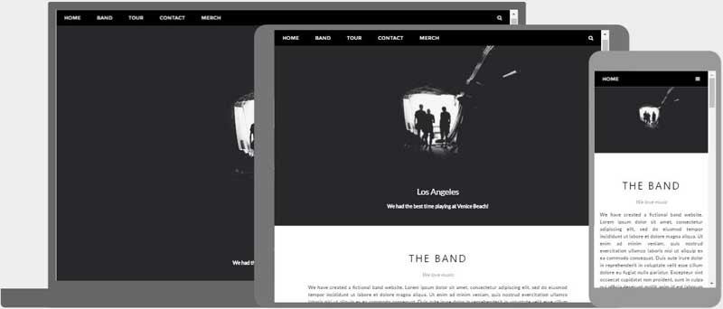
Responsive Web Page – Full Example
A responsive web page should look good on large desktop screens and on small mobile phones.
<!DOCTYPE html>
<html>
<head>
<meta name="viewport" content="width=device-width, initial-scale=1.0">
<style>
* {
  box-sizing: border-box;
}

.menu {
  float: left;
  width: 20%;
  text-align: center;
}

.menu a {
  background-color: #e5e5e5;
  padding: 8px;
  margin-top: 7px;
  display: block;
  width: 100%;
  color: black;
}

.main {
  float: left;
  width: 60%;
  padding: 0 20px;
}

.right {
  background-color: #e5e5e5;
  float: left;
  width: 20%;
  padding: 15px;
  margin-top: 7px;
  text-align: center;
}

@media only screen and (max-width: 620px) {
  /* For mobile phones: */
  .menu, .main, .right {
    width: 100%;
  }
}
</style>
</head>
<body style="font-family:Verdana;color:#aaaaaa;">

<div style="background-color:#e5e5e5;padding:15px;text-align:center;">
  <h1>Hello World</h1>
</div>

<div style="overflow:auto">
  <div class="menu">
    <a href="#">Link 1</a>
    <a href="#">Link 2</a>
    <a href="#">Link 3</a>
    <a href="#">Link 4</a>
  </div>

  <div class="main">
    <h2>Lorum Ipsum</h2>
    <p>Lorem ipsum dolor sit amet, consectetuer adipiscing elit, sed diam nonummy nibh euismod tincidunt ut laoreet dolore magna aliquam erat volutpat.</p>
  </div>

  <div class="right">
    <h2>About</h2>
    <p>Lorem ipsum dolor sit amet, consectetuer adipiscing elit.</p>
  </div>
</div>

<div style="background-color:#e5e5e5;text-align:center;padding:10px;margin-top:7px;">© copyright w3schools.com</div>

</body>
</html>
Responsive Web Design – Frameworks
All popular CSS Frameworks offer responsive design.
They are free, and easy to use.
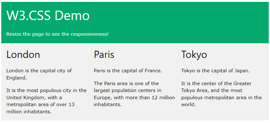
W3.CSS
W3.CSS is a modern CSS framework with support for desktop, tablet, and mobile design by default.
W3.CSS is smaller and faster than similar CSS frameworks.
W3.CSS is designed to be independent of jQuery or any other JavaScript library.
<!DOCTYPE html>
<html>
<head>
<title>W3.CSS</title>
<meta name="viewport" content="width=device-width, initial-scale=1">
<link rel="stylesheet" href="https://www.w3schools.com/w3css/4/w3.css">
</head>
<body>

<div class="w3-container w3-green">
  <h1>W3Schools Demo</h1>
  <p>Resize this responsive page!</p>
</div>

<div class="w3-row-padding">
  <div class="w3-third">
    <h2>London</h2>
    <p>London is the capital city of England.</p>
    <p>It is the most populous city in the United Kingdom,
    with a metropolitan area of over 13 million inhabitants.</p>
  </div>

  <div class="w3-third">
    <h2>Paris</h2>
    <p>Paris is the capital of France.</p>
    <p>The Paris area is one of the largest population centers in Europe,
    with more than 12 million inhabitants.</p>
  </div>

  <div class="w3-third">
    <h2>Tokyo</h2>
    <p>Tokyo is the capital of Japan.</p>
    <p>It is the center of the Greater Tokyo Area,
    and the most populous metropolitan area in the world.</p>
  </div>
</div>

</body>
</html>
To learn more about W3.CSS, read our W3.CSS Tutorial.
Bootstrap
Another popular CSS framework is Bootstrap:
<!DOCTYPE html>
<html lang="en">
<head>
  <title>Bootstrap 5 Example</title>
  <meta charset="utf-8">
  <meta name="viewport" content="width=device-width, initial-scale=1">
  <link href="https://cdn.jsdelivr.net/npm/bootstrap@5.2.3/dist/css/bootstrap.min.css" rel="stylesheet">
  <script src="https://cdn.jsdelivr.net/npm/bootstrap@5.2.3/dist/js/bootstrap.bundle.min.js"></script>
</head>
<body>

<div class="container-fluid p-5 bg-primary text-white text-center">
  <h1>My First Bootstrap Page</h1>
  <p>Resize this responsive page to see the effect!</p>
</div>

<div class="container mt-5">
  <div class="row">
    <div class="col-sm-4">
      <h3>Column 1</h3>
      <p>Lorem ipsum dolor sit amet, consectetur adipisicing elit...</p>
      <p>Ut enim ad minim veniam, quis nostrud exercitation ullamco laboris...</p>
    </div>
    <div class="col-sm-4">
      <h3>Column 2</h3>
      <p>Lorem ipsum dolor sit amet, consectetur adipisicing elit...</p>
      <p>Ut enim ad minim veniam, quis nostrud exercitation ullamco laboris...</p>
    </div>
    <div class="col-sm-4">
      <h3>Column 3</h3>
      <p>Lorem ipsum dolor sit amet, consectetur adipisicing elit...</p>
      <p>Ut enim ad minim veniam, quis nostrud exercitation ullamco laboris...</p>
    </div>
  </div>
</div>

</body>
</html>
To learn more about Bootstrap, go to our Bootstrap Tutorial.
(https://www.w3schools.com/html/html_responsive.asp)